CASE STUDYAI Patient Summary
Timeline: Q2, 2025
Clinicians were spending 15+ minutes prepping for each patient visit — jumping between 8+ data sources, copying whatever info they could into Google Gemini, and hoping for a useful summary. It wasn't working: prep took too long, outputs were inconsistent, and there were no safety guardrails. This was limiting how many patients providers could see per day—a top company priority.
I designed an AI tool that cut prep time to under 5 minutes while maintaining the clinical context and safety clinicians needed to trust it.

Research
I started by understanding how clinicians actually prepped for visits:
Shadowed 4 providers during their prep workflows to see the process, workarounds, and pain points firsthand.
Analyzed their Gemini usage to understand how they were already trying to use AI — and where it was falling short (unstructured prompts, no sources, inconsistent outputs).
Mapped the data sources they needed to pull from: EMR (medications, history, labs, visit notes), CRM (care plans, chat history), and clinical decision tools.
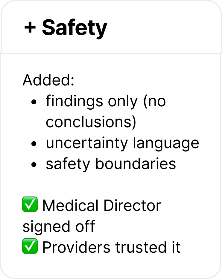
Interviewed the Medical Director to define clinical safety requirements and what "good enough to trust" actually looked like.
Before: Providers manually gathered data from 8+ sources, pasted it into Gemini with unstructured prompts, and got incomplete, clinically risky summaries.
Guiding Principles for the design
-
Show how the AI reached conclusions, not just the answer. Every insight links to source data.
-
The same data means different things depending on the task. Prioritize based on visit type.
-
Surface insights clinicians might miss, but keep humans in control of decisions.
-
AI will be wrong sometimes. Make errors obvious and easy to correct.
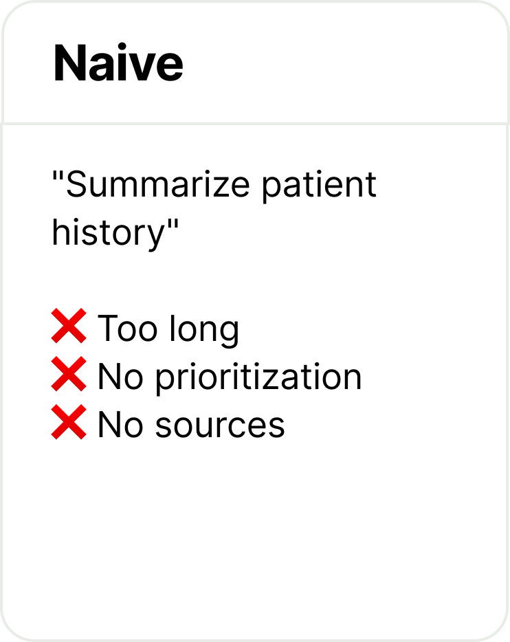
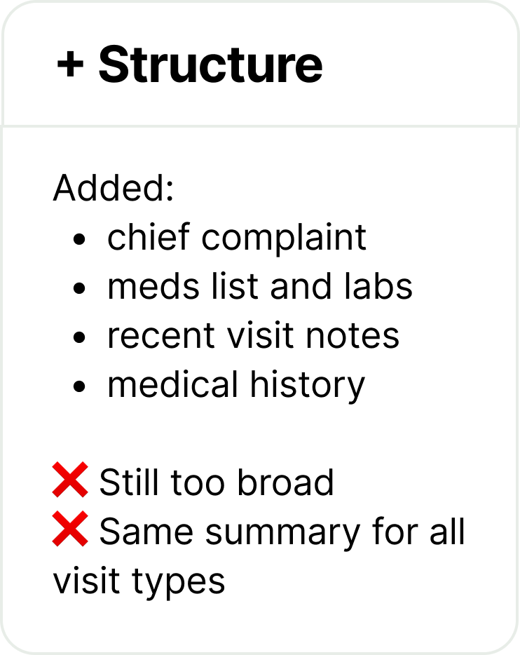
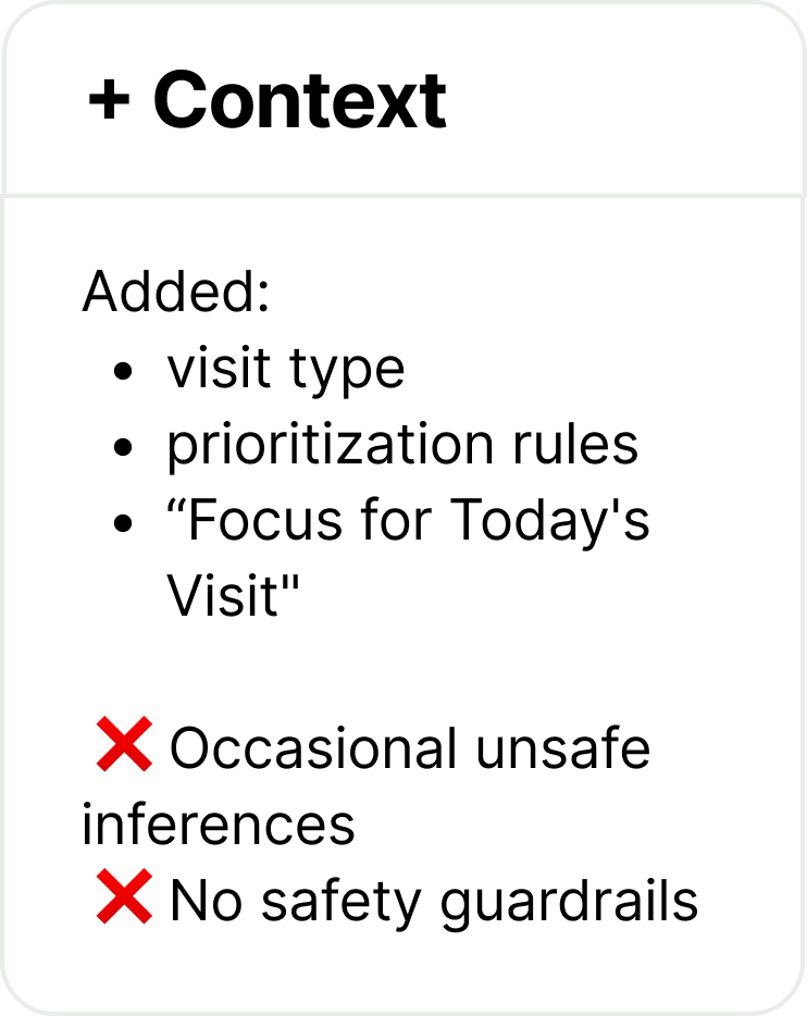
Prompt Engineering Iterations
Getting useful, safe outputs took multiple rounds of refinement:
Choosing the interaction surface
Where the AI summary lived in the interface was a critical early decision — it would affect workflow, safety, and how easily we could extend the pattern to future features.
I evaluated four options:
Inline: Would need to exist in too many places — not scalable
Sidebar: Info density pushed important content down, broke some layouts
Full-page: Too much of a "destination" — tab-switching created confusion about which patient providers were viewing (a safety risk)
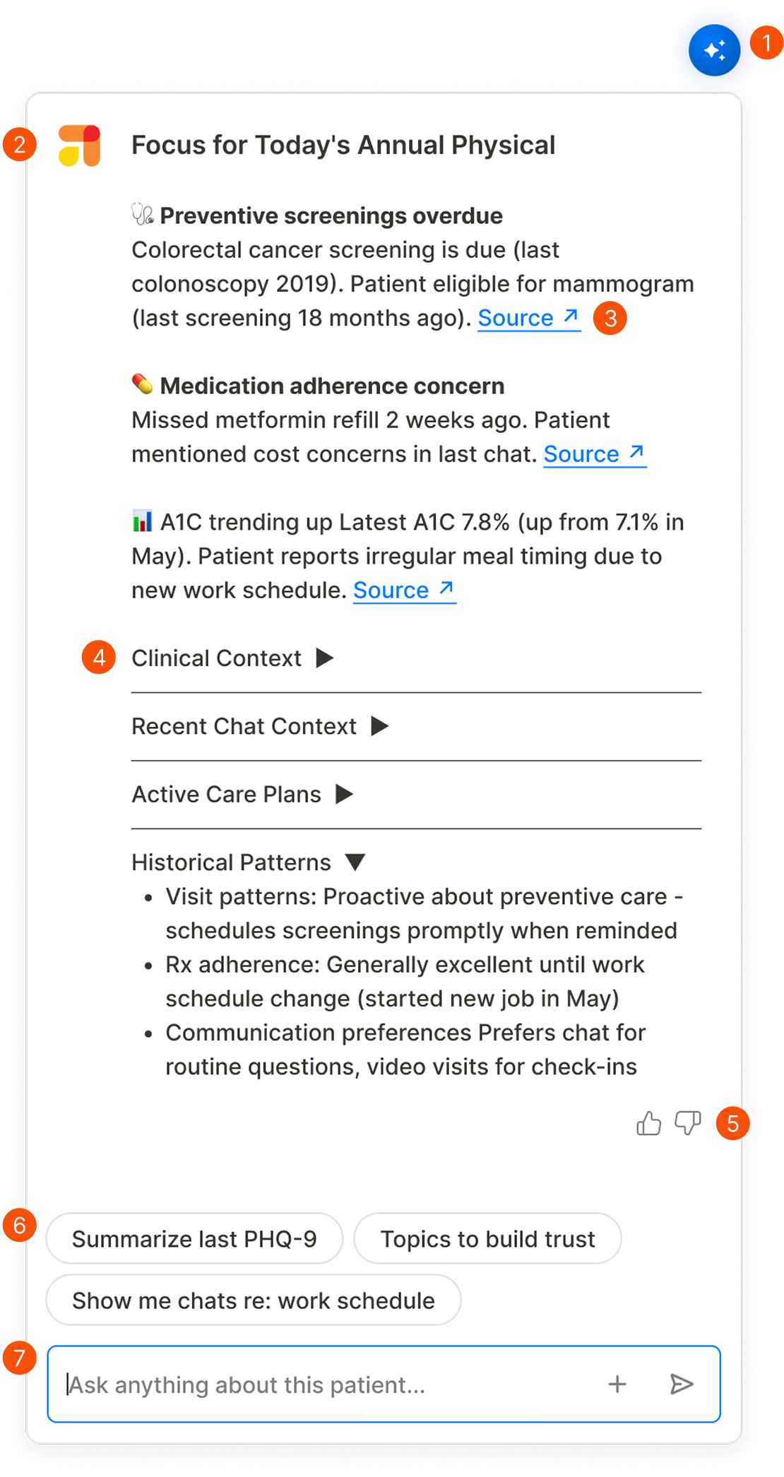
✓ Floating overlay: Accessible anywhere, persistent across contexts, doesn't disrupt existing layouts
Matching output mental models
Providers structure visits around priority topics—it's how they manage limited time. The AI output needed to match that.
"Focus for Today's Visit" leads the summary
Source links on every claim
Expandable sections for depth on demand
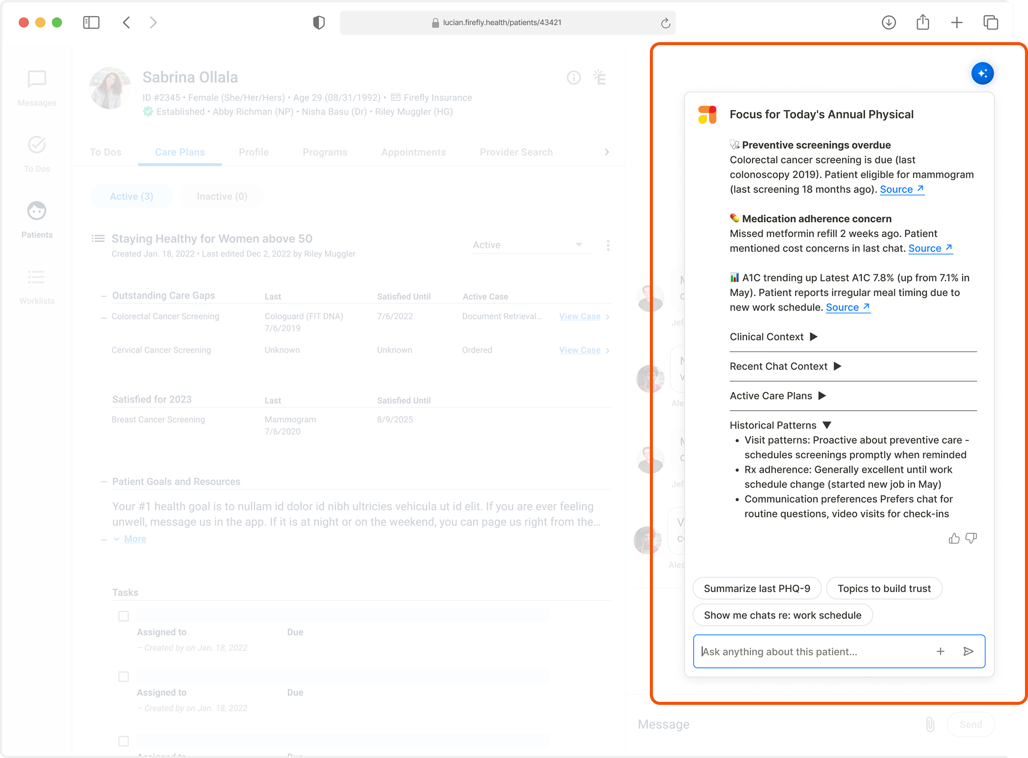
The floating overlay sits on top of the patient profile, accessible from any tab without disrupting workflow.
Final design
The AI Patient Summary launched as Firefly's first production AI tool, integrated directly into the provider CRM.
Foundational components The design established reusable patterns for future AI features:
Floating action button — accessible across all patient profiles, opens overlay without disrupting workflow
Conversational — providers ask follow-up questions and refine outputs in natural language
Structured output with sources — every insight links to underlying data
Expandable sections — depth on demand
Feedback controls — thumbs up/down to improve outputs over time
Suggested prompts — AI-generated based on patient and visit context
Follow-up input — natural language refinement
67%
Reduction in visit prep time (15+ min → under 5)
2-3
additional patient visits per day per provider
100%
adoption among clinical staff
More Case Studies

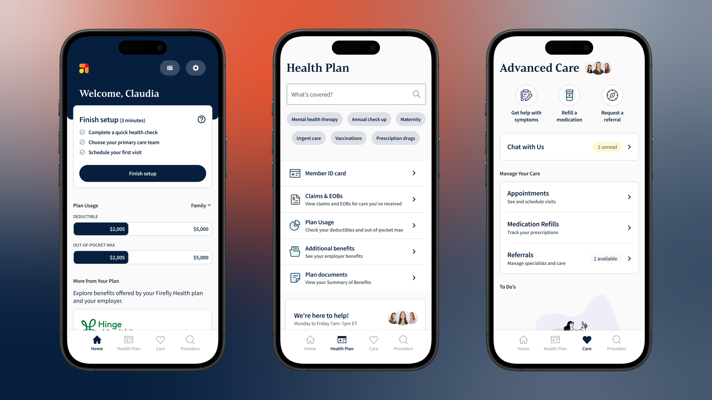
AI Member Self-Service
Designed self-service AI tools that reduce operational costs while improving member experience for routine healthcare tasks
Designing a Scalable Product Foundation
Built a member app and provider CRM from scratch for an early-stage startup, creating a product foundation that scaled from 5 employees to enterprise health plan.
App Rearchitecture & Brand Refresh
Rearchitected Firefly's core mobile app to improve user experience, reduce technical debt, and support rapid feature development as we scaled to enterprise clients.
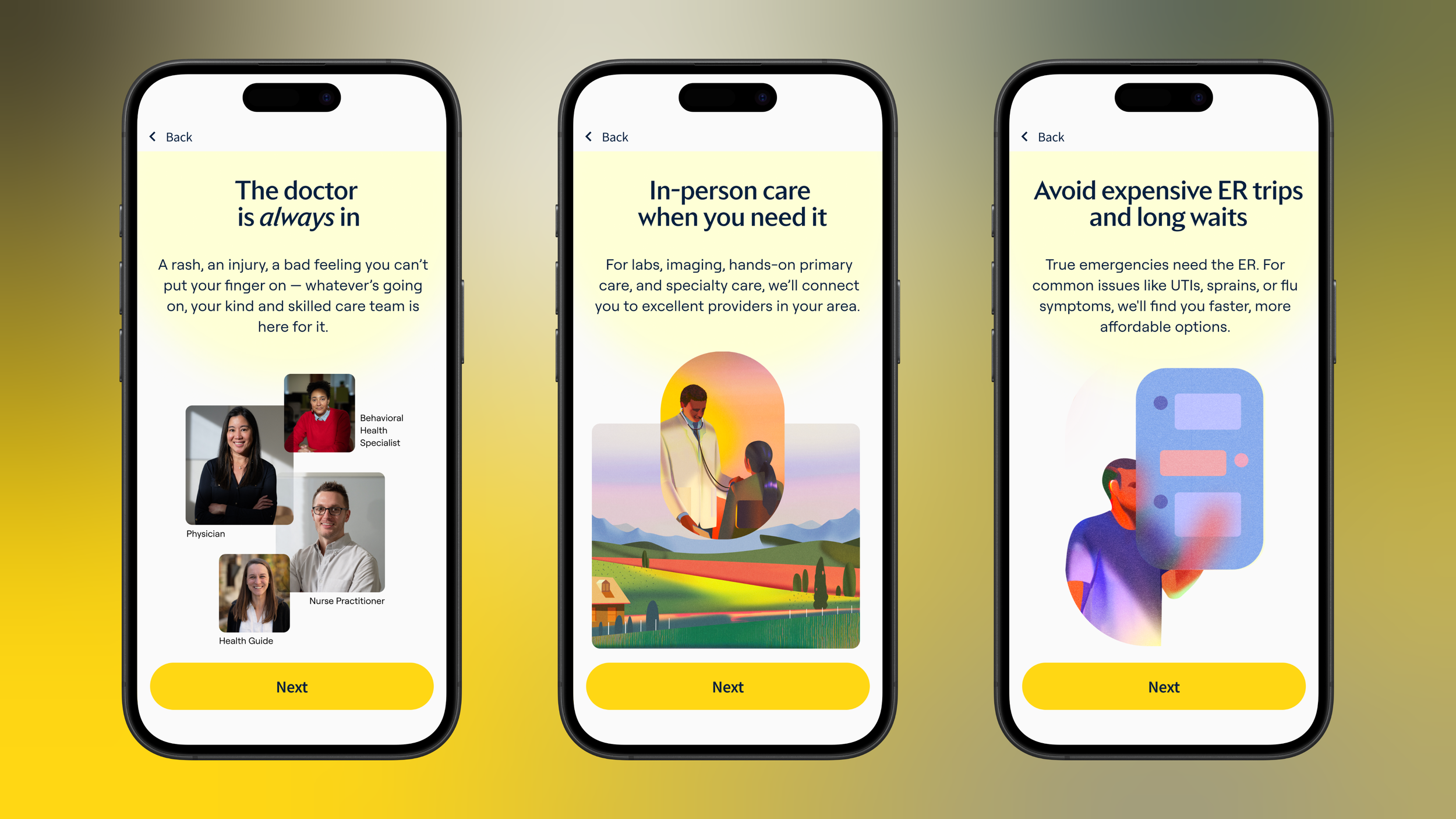
Signup & Onboarding Redesign
Redesigned signup flow and onboarding process, increasing completion by 23% and first appointment scheduling by 15% while supporting three distinct member types.
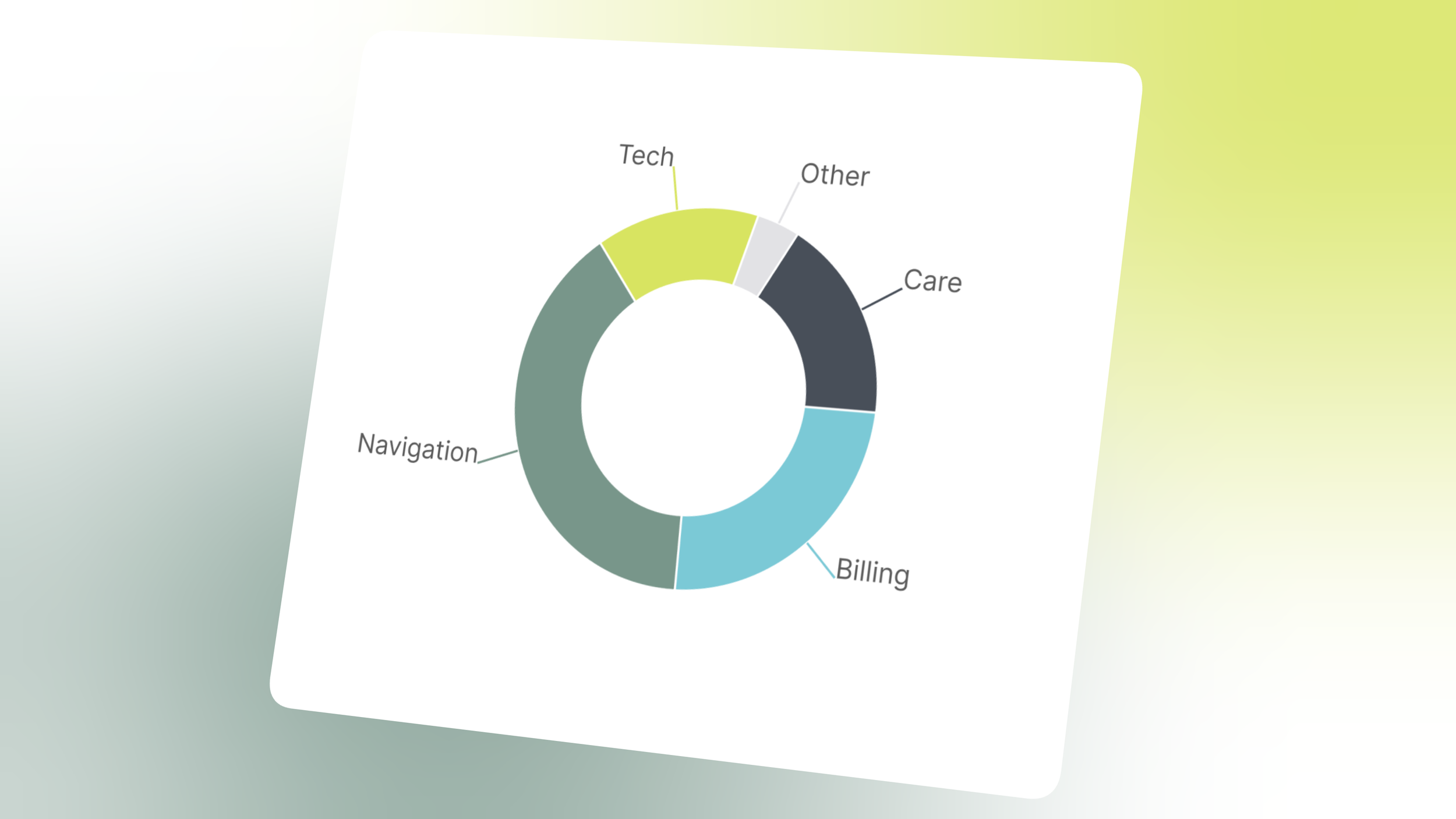
Customer Health Monitoring
Created systematic customer intelligence program that transformed overlooked satisfaction trends into company-wide accountability, preventing cx crisis during major business pivot.