CASE STUDY / FIREFLY HEALTHOnboarding Redesign
Timeline: Q2, 2024
Challenge: During Firefly's pivot to a comprehensive health plan, we needed to update our onboarding to support fundamentally new member types. Meanwhile, we were also seeing conversion issues limiting conversion and long-term engagement.
Research & Discovery
I conducted usability testing, journey mapping, competitive analysis, and data analysis of the existing process to identify the most impactful opportunities.
Critical insights:
Complexity overwhelm: Existing onboarding collected too much information upfront
Unclear value proposition: Members didn't understand what made Firefly different
Missing context: Different member types had distinct needs but received identical experiences
Post-signup gap: Members who completed signup often didn't schedule their first appointment
Poor timing: We asked for personal health info before members understood and trusted the platform
Usability testing was conducted on the existing signup and onboarding process through usertesting.com, identifying friction points and highest-impact opportunities for the redesign.
Design Process
Core design principles:
Progressive disclosure: Only ask for information when members understand why it matters
Value-first approach: Lead with benefits—what’s most useful right now to the member?
Trust building: Introduce care team before requesting sensitive health data
Journey-specific customization: Tailor experience by member type without adding user complexity
Key design decisions:
Simplified entry point with welcoming introduction explaining Firefly's approach
Smart branching logic based on member type
Contextual health intake and team selection after members understand their care model
Seamless handoff to appointment scheduling as a natural final step in the onboarding experience
Complete user flow diagram for app signup and onboarding, developed through collaborative design-led sessions with engineering and cross-functional teams to align on all requirements and de-risk implementation.
Key screens from the Figma design file showing native app as well as responsive website versions of the improved signup and onboarding experience.
Validation & Testing
Before implementing the full redesign, I conducted validation testing to de-risk and refine the experience. This included Figma prototype testing on usertesting.com and detailed walkthroughs with cross-functional stakeholders.
Key findings:
Care team introduction timing tested well - new users felt more confident sharing info after meeting their providers
Progressive disclosure approach reduced perceived complexity without increasing actual completion time
First appointment integration significantly improved scheduling intent
Refinements made:
Simplified health goals selection based on user feedback about number of steps
Added contextual help for insurance verification step
Enhanced care team bios based on what information members found most important
23%
increase in completion rate
15%
increase in first-visit bookings
within 48 hours
0%
increase in user complexity
Context transforms compliance
People don't resist sharing health information - they resist sharing it without understanding why it matters. By introducing the care team and explaining our model before collecting data, we turned form completion from a compliance exercise into an investment in their care.
Complex redesigns require systems thinking
This project succeeded because we treated it as both a UX and systems challenge. Working closely with engineering to rebuild the backend infrastructure while redesigning the frontend meant we could create truly adaptive experiences rather than just restyling existing flows.
So what did we learn?
Progressive disclosure works differently in healthcare
Unlike industries like e-commerce, where the main objective is minimizing friction, healthcare onboarding requires building more trust and understanding. The "shortest path" isn't always the best path when people need to feel confident about their care decisions.
Complex requirements ≠ complex experience
Supporting three member types initially felt like a constraint, but it forced us to create clearer value propositions for each member type and ultimately more personalized near- and long-term experiences.
Case Studies
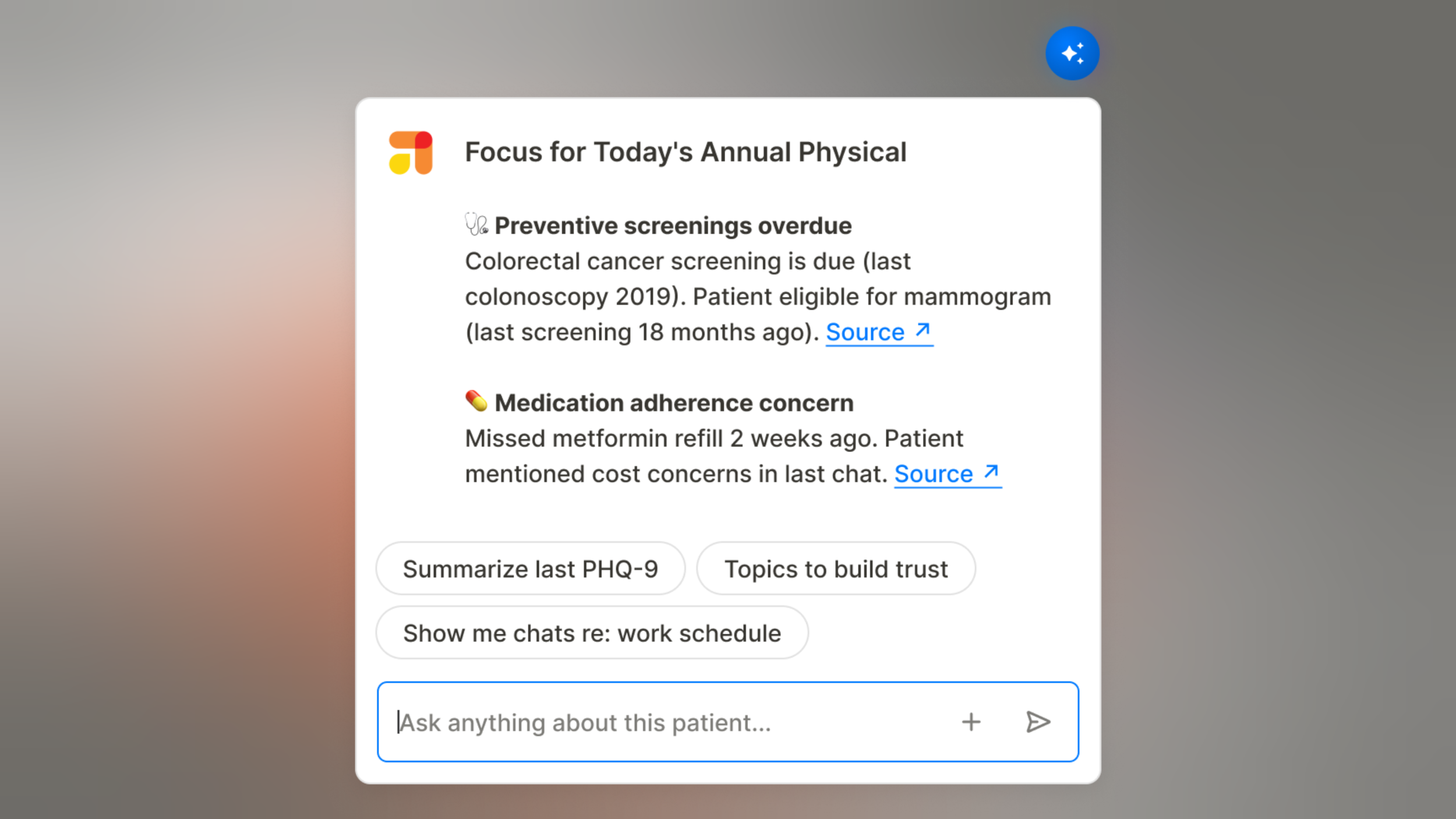
AI Patient Summary
Designed an embedded AI tool that cut clinician visit prep time by 67% — from 15+ minutes to under 5 — while maintaining the clinical context and safety providers needed to trust it.

AI Member Self-Service
Designed self-service AI tools that reduce operational costs while improving member experience for routine healthcare tasks
Designing a Scalable Product Foundation
Built a member app and provider CRM from scratch for an early-stage startup, creating a product foundation that scaled from 5 employees to enterprise health plan.
App Rearchitecture & Brand Refresh
Rearchitected Firefly's core mobile app to improve user experience, reduce technical debt, and support rapid feature development as we scaled to enterprise clients.
Customer Health Monitoring
Created systematic customer intelligence program that transformed overlooked satisfaction trends into company-wide accountability, preventing cx crisis during major business pivot.