CASE STUDY / FIREFLY HEALTHApp
Redesign
Timeline: 2024, Q1-2
Challenge: As Firefly evolved from a primary care app to a comprehensive health plan, our mobile experience needed fundamental restructuring. We had multiple pressures converging: competitive market demands, user feedback opportunities, and business requirements to support new member journeys.
Research & Discovery
I conducted comprehensive user research and competitive analysis to understand how our current architecture was limiting both user experience and business goals, while working with Product Management to scope out new business requirements.
Critical insights:
Navigation confusion: Members couldn't distinguish between care features and health plan features, leading to frustration and support tickets
Proactive customer service positioning: As a new health plan experiencing operational growing pains, we weren't adequately highlighting available support resources to help members resolve issues
Scalability constraints: Previous information architecture couldn't accommodate new features without exponentially increasing complexity and member confusion
Member type blindness: All members saw nearly identical experiences regardless of their user type and needs
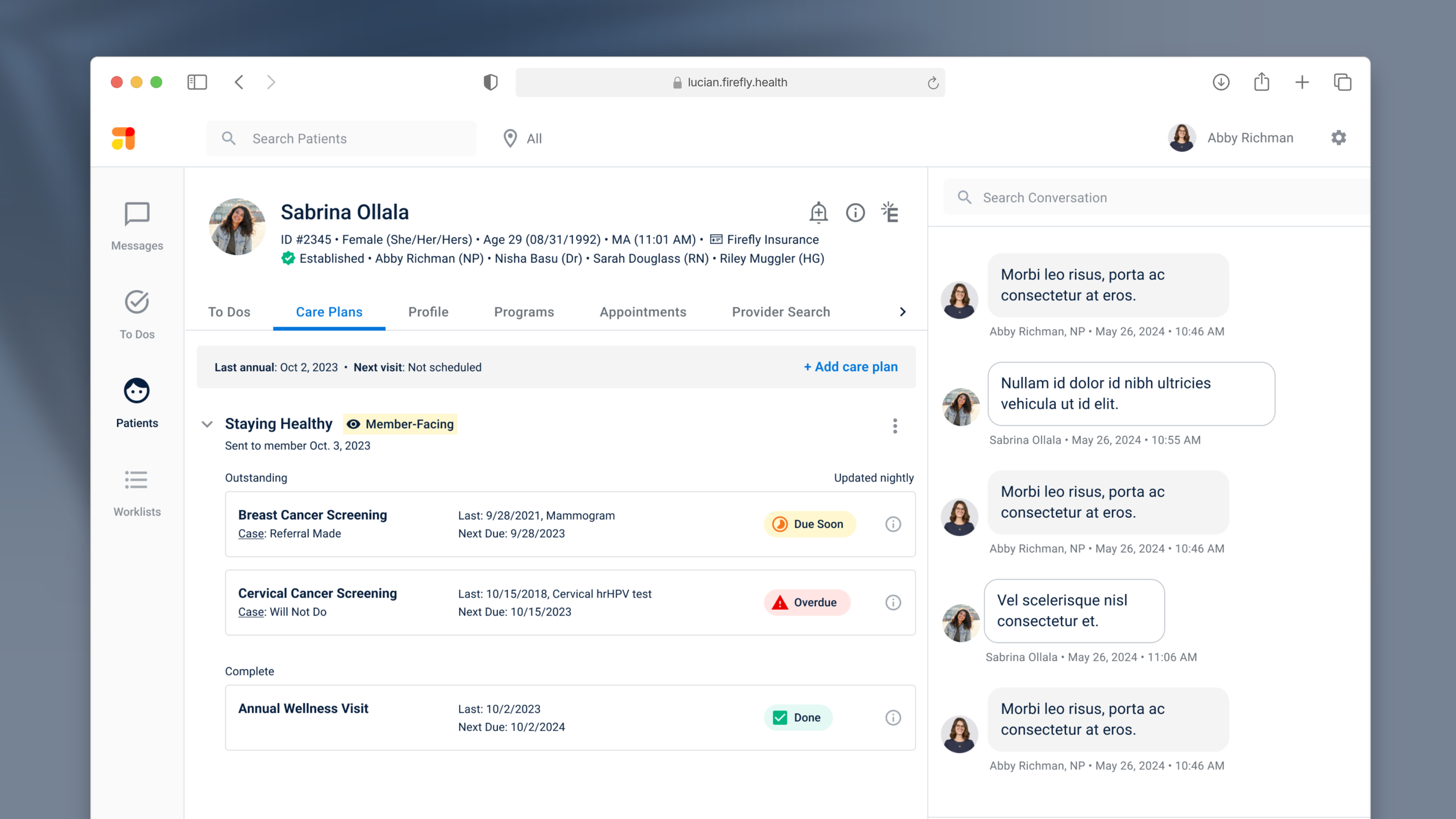
Key screens from the Figma design file showing Home Screen States for each member type (i.e. Care-Only, Care & Coverage, Coverage-Only) and status (e.g. Onboarding, Established, Discharged)
Design Process
Based on research insights, I developed a comprehensive redesign strategy that would fundamentally restructure the app while maintaining familiar patterns for existing members.
Key architectural decisions:
Home page reorganization with three logical feature groups: self-service actions, care team engagement, and care management
Restructured bottom navigation removing Profile/Settings to focus on core member actions (Home, Care Plans, Health Plan, Providers)
Elevated customer service prominently featured in Health Plan section with multiple contact options
Separated Profile and Settings conceptually and spatially to reduce cognitive load
Smart feature visibility showing relevant functionality based on member type and care history
Flexible component system enabling rapid feature additions without architectural changes
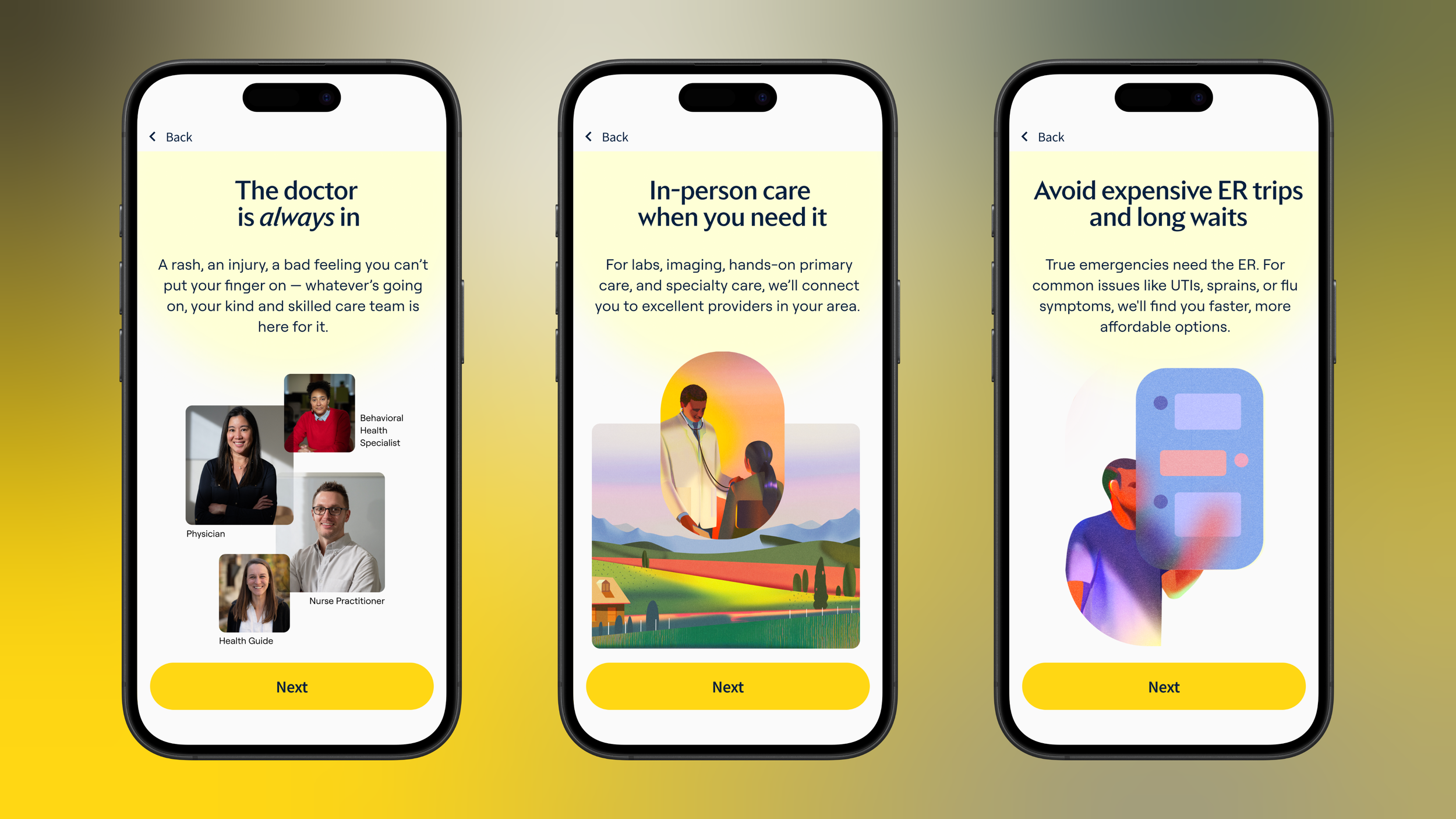
App Home & Secondary Screens
Validation & Testing
Before implementing the full redesign, I conducted extensive validation to ensure the new architecture would improve rather than disrupt member experiences.
Information architecture improvements tested positively - members found grouped functionality more intuitive and scannable
Bottom navigation simplification reduced confusion without impacting feature discoverability
Customer service prominence was well-received by members who appreciated transparent access to help
Member type adaptability worked invisibly - members saw relevant features attuned with their individual journey and needs
Refinements made:
Adjusted feature grouping on Home based on member mental models from prototype walkthrough
Enhanced visual hierarchy with stronger contrast and spacing after accessibility testing
Positive member response
to clearer navigation and feature organization during testing
Improved development velocity
enabling rapid addition of new features without architectural debt
Foundation for growth
through standardized component system and clearer architecture
A solid foundation enables agility
This project succeeded because we treated it as infrastructure investment, not just visual updates. By rebuilding the information architecture with flexibility in mind, we created a foundation that could accommodate rapid feature additions and member type complexity without exponential design debt.
Proactive support creates loyalty
Rather than hiding operational growing pains, prominently featuring customer service turned potential friction into a competitive advantage. Members appreciated knowing help was easily accessible, which increased confidence in our health plan offering.
Learnings
One interface, multiple journeys
Supporting three different member journeys didn't require three different interfaces. Smart filtering and progressive disclosure allowed us to create personalized experiences that felt simple and focused rather than overwhelming and complex.
Systematic design increases velocity
Establishing standardized patterns and flexible components during this redesign significantly improved development velocity for future features. The upfront investment in systematic thinking paid dividends in reduced engineering complexity and faster iteration cycles.
Case Studies
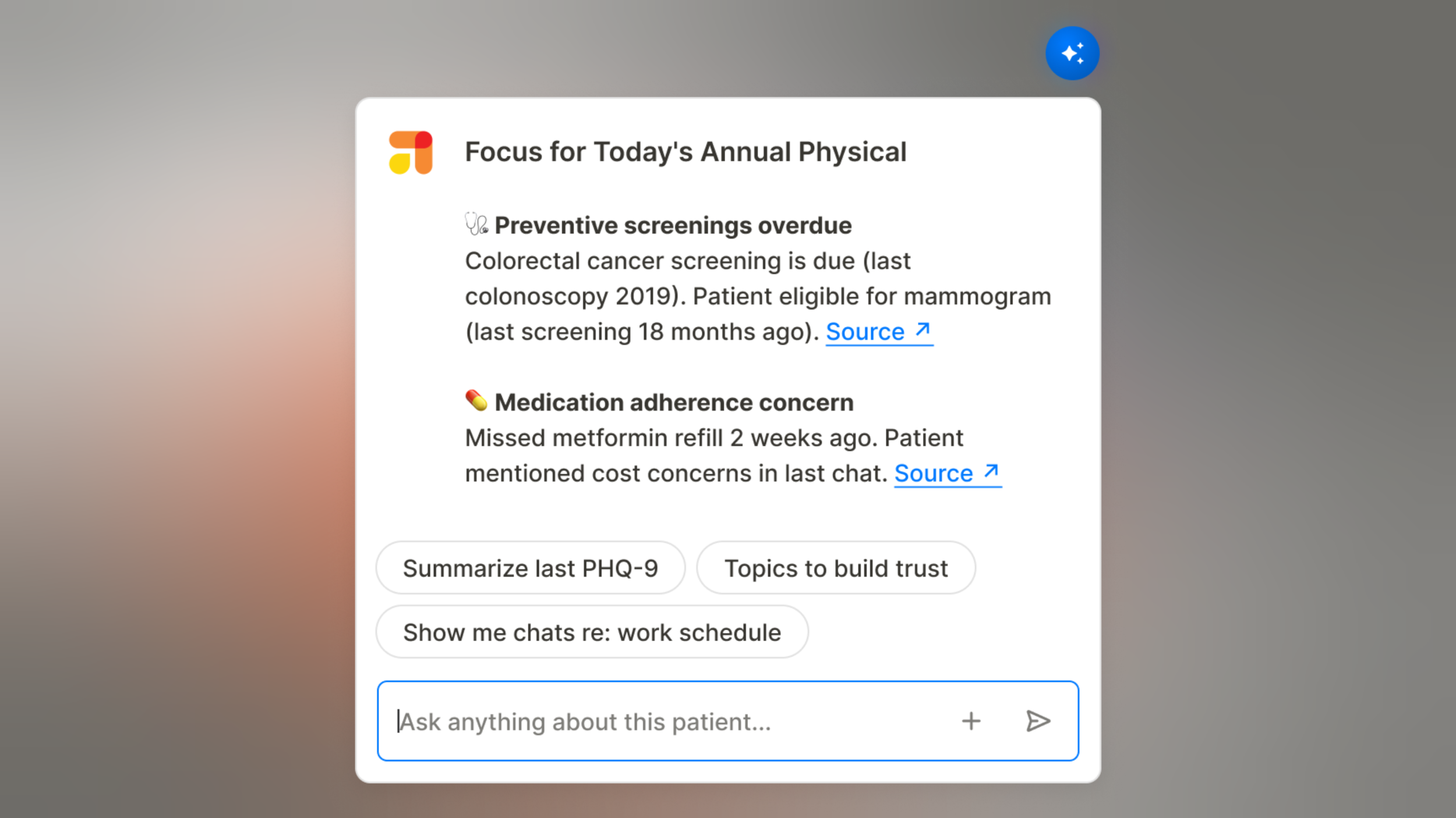
AI Patient Summary
Designed an embedded AI tool that cut clinician visit prep time by 67% — from 15+ minutes to under 5 — while maintaining the clinical context and safety providers needed to trust it.

AI Member Self-Service
Designed self-service AI tools that reduce operational costs while improving member experience for routine healthcare tasks
Designing a Scalable Product Foundation
Built a member app and provider CRM from scratch for an early-stage startup, creating a product foundation that scaled from 5 employees to enterprise health plan.
Signup & Onboarding Redesign
Redesigned signup flow and onboarding process, increasing completion by 23% and first appointment scheduling by 15% while supporting three distinct member types.
Customer Health Monitoring
Created systematic customer intelligence program that transformed overlooked satisfaction trends into company-wide accountability, preventing cx crisis during major business pivot.